In the Studio with Kour Pour: Cultural Cartographer
“It is known that names of places change as many times as there are foreign languages; and that every place can be reached from other places, by the most various roads and routes, by those who ride, or drive, or row, or fly.” Italo Calvino, Invisible Cities
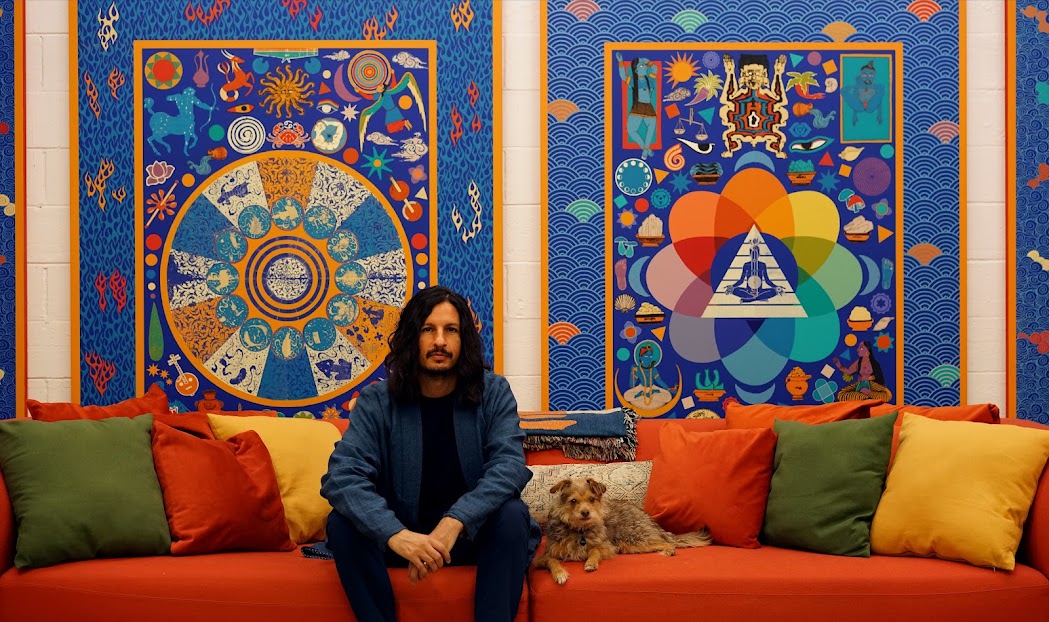
Reflecting on arrivals and departures, precious cargo, and fellow travelers, the view from 10,000 feet up, destiny or destinations is unavoidable when encountering the interdisciplinary practice of U.K.-born, L.A.-based artist Kour Pour. A steady rhythm of airplanes cruise over his Inglewood studio to and from nearby LAX, a perpetual reminder of worlds that exist beyond the shores of Santa Monica.
Working in close proximity to one of the busiest airports on the planet is a fitting setting for an artist whose work explores the liminal spaces where people meet, and exchanges take place. Pour is a painter of contact zones, the bridges, and borderlands that connect and divide intertwined cultural histories. Being born into a family of mixed heritage and then later moving to a new country to pursue art school in Los Angeles has made Pour sensitive to the experience of those he refers to genially as out-of-towners. Migrating was a formative experience for the young artist, and his body of work continues to question categories of the exotic, the foreign, the tourist, and the guest. After 15 years of developing a polyglottal practice in Los Angeles, a city where over 200 languages are spoken, the British-Iranian-American painter is quintessentially Angeleno.
Kour welcomed me into his studio alongside his wife Katya and their dog Huxley for a three-hour tour of his past works, current experiments, and future projects. Each room of the studio presented a different facet of the artist’s prolific output. One room contained his experiments using tea as dye and spice as pigment; another was a research den brimming with books stacked shin-high like cairns, while wooden studies into Modernist abstraction were dispersed across the floor of a third room. Pour inhabits and embraces that transitional space between ideas, artworks, and new series, many of which evolve from the ongoing series of Carpet paintings he made his name with when they debuted over a decade ago.
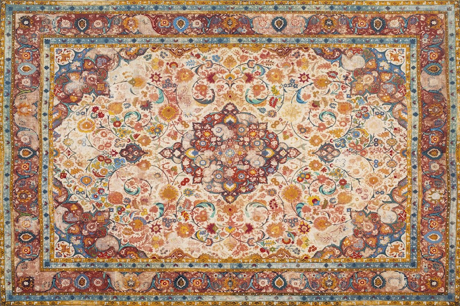
Dating back to as early as 2009, Pour’s Carpet paintings were inspired by the Persian rugs he encountered in his father’s store in Exeter as a child. When starting these large format, 8ft by 6ft screen-printed and acrylic-painted panels, the artist applies gesso to canvas with a push broom to produce a horizontal and vertical grid that mimics the interweaving warp and weft of a carpet. After the overpainting is finished, he runs a power sander over the surface, which creates a time-worn fading while also revealing the texture of the simulated carpet’s threads. The resulting work is a tightly executed simulacrum of a carpet that balances the symmetrically patterned abstractions of the screen print with bright painterly embellishments.
Eternal Springtime (Nowruz), 2017 – 2021, acrylic on canvas over panel, 96 x 144 inches. Photo: Courtesy of the artist
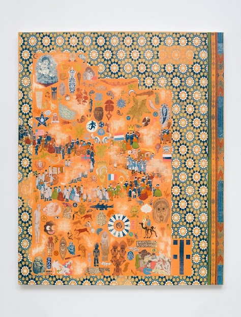
Drawing from a vast and prodigious visual lexicon, Pour’s work references and reimagines artistic traditions as diverse as Korean Minhwa, Persian miniature, Islamic geometry, and Medieval European marginalia. Iconographically, his work is populated by strange bedfellows. In the endlessly surprising visual density of his Polypaintings (2016-ongoing), for example, fragmented Egyptian hieroglyphs float near Hopi kachina dolls, Roman coins cohabitate with Chinese phoenixes, artistic canons compete and collide, scattered across the canvas like seeds, each coexisting side by side without hierarchy.
The work points to the temporal and spatial coexistence of disparate and diasporic communities. But this isn’t mere bumper sticker fodder for milquetoast multiculturalism; the artist’s understated wit subverts any simplistic reading of the work. One particularly powerful detail in his Migration Painting (2016-17) features a pair of exotic hunting trophies. The first is a tiger skin rug laid out wide and flat on its stomach, a big game safari souvenir. Just above the skin floats another exotic trophy, this one a young Tahitian girl lying prone, naked, and scared on her belly—a reframing of the central image in “Spirit of the Dead Watching,” Paul Gauguin’s infamous 1892 painting of his teenage wife. By imbuing the oft-neutral connotation of the term migration with the violence of colonial predation, the artist launches a subtle shot beyond visual legacies toward language writ large. Pour’s works demand this level of engagement; they encourage a multiplicity of viewings and readings. These paintings contain multitudes.
Migration Painting, 2016-2017, acrylic on canvas over panel, 65 x 53 inches
In September 2023, the artist presented 12 new works in Hong Kong. These bold, Babylonian blue paintings continue his thematic exploration of migration, cultivation, translation, and fornication. The title of the exhibition “Ten Thousand Things and One Suchness” is a phrase borrowed from a lecture by Alan Watts on Zen Buddhism—an affirmation that all things which exist derive from one cosmic energy that crests and troughs, in repeating cycles, like the blue waves in the borderlands of Kour Pour’s paintings.
After meeting in LA. I caught up with Kour over Zoom where we discussed borders, the wisdom of praying mantis, and embracing the unexpected.
MT: Can you tell me the origin of your carpet paintings?
KP: The early ones were based on images of carpets that I grew up with or that you might find in anyone’s living room. I was thinking about the iconography of a rug and the utility of a rug as an object that delineates a home—also, the portable nature of the rug. You’re able to roll it up and travel with it, then unravel it in anyplace that you end up. Then, you have the patterns and imagery that come from interactions with different cultures, trade routes, etc. There’s also the craft aspect. Re-evaluating how we look at fine art painting versus so-called crafts made in other parts of the world.
MT: The last time we met, you mentioned that traditional Persian rugs functioned as maps, too.
KP: Yes, exactly; they are aerial views of a Persian garden. Within that concept, you have a border that indicates north, south, east, and west, and contained within that border is the whole natural and supernatural world.
MT: Tell me about the importance of the border in your work.
KP: There’s obviously the conceptual idea of what a border is. I think I’m playing with that in the studio quite a bit. You also see it in the tiger paintings where there is this border that some people look at as a book page, which I think is an appropriate reading because I’m pulling that imagery from books. In this case the border nods to the fact that the image isn’t mine and that I have taken it from someplace else.
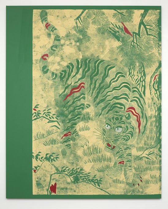
Jade Tiger, 2021, block printing ink, acrylic, and oil on canvas, 94 x 76 inches
MT: So the printed border becomes a gesture toward this tradition of copying and the idea of the copy in the Minhwa tradition?
KP: Yes, this happens with Minhwa painting and even with carpet designs which have been copied with variations over centuries. In many ways everything I’m doing continues this global tradition of taking something that came before and building upon that.
Block printing is a method of reproduction, and printmaking was essentially created to reproduce and spread information. So my work mimics these folk artists who are themselves copying paintings. When I make a work using printmaking methods there is always this beautiful moment where the paint transfers from one surface to another, and within that transfer parts of an image are lost, or something new appears.
MT: I read that the tiger and the magpie often featured in Minhwa paintings have a satirical relationship. The “idiot tiger” represents the aristocracy while the magpie, who is always just beyond the eyeline of the tiger, is representative of the people. They are political paintings, in other words. Was that on your mind when you were making these?
KP: It’s great that you bring it up because I don’t think anyone has made that connection yet. It’s evident in those traditional paintings. You see this magpie on the branch, and it’s just squawking at the tiger. I got deeper into the tiger works around 2020-2021 so I think it would be fair to remember the political and social moment at the time and read the tiger paintings within that context.
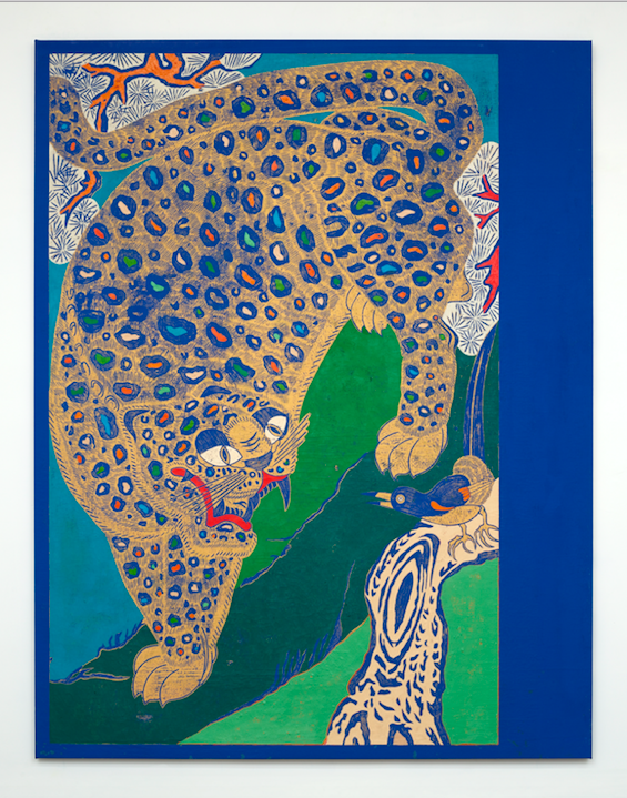
Peacock Tiger, 2020-2021, block printing ink, acrylic, and oil on canvas, 94 x 76 inches
MT: What does your research process look like?
KP: I do a lot of research but I don’t start there. Whether I’m beginning to create an artwork or a series, there has to be something that speaks to me before I start any research. (pauses)
I used to have a praying mantis in my studio that showed up one summer. I couldn’t tell if it was injured or not, so I brought it inside, bought it a terrarium, put some sticks in there, fixed it up so it had a pretty cool living space, and then I realized I’ve got to feed this thing. During the summer we’d have a lot of flies in the studio and they would land on the paintings because we paint flat sometimes. So we would wait and hover over the fly with a cup, and slide a postcard or something underneath, and release it into the terrarium and just watch. We named it Bowie. And Bowie just sits there and waits. Every movement it makes seems very thoughtful and careful and it would only move when something would grab its attention. It was fascinating to watch. That’s sort of me in the studio. I sit still and wait for something to come, and then when something does come, I go for it and there’s a lot of energy that goes into it.
So, I would say you have to have one of those experiences that you can’t really articulate first. Then I try to understand it, and I do the research, and I try to figure out what it is that I’m responding to. Often, the connecting theme throughout the work is that the things that I respond to have these shared cultural origins. I trust my gut at this point and try not to dictate where the studio is going too much. I try to listen and let it flow.
MT: You follow it.
KP: Yeah. It’s a journey, and there are a lot of different ways of making art. I am interested in learning and being on a journey and letting it take me somewhere.
MT: The theme of the journey circles around your work. The idea of migration, of exchange, of an itinerant nature between people, places and things…
KP: And I would add the element of the unexpected. I think people like the sequence of one step turning into another. That’s not really how life works. Sometimes you take little steps, sometimes something big happens that takes you to a completely different place. I feel like that happens in the studio too, I’m not trying to control how the work unfolds.
MT: What inspired these bold blue canvases in your recent show “10,000 Things and One Suchness”?
KP: A few things were going on when I started the paintings. I was healing from an injury, and that deep blue color corresponded with where I was and what I needed. It’s a really bright blue, but it’s almost sort of a twilight color. Is it light, or is it dark? I like the idea of it being twilight, which is neither night nor day. It’s somewhere in between. I think they have a stillness or a “where time stops still” feeling.
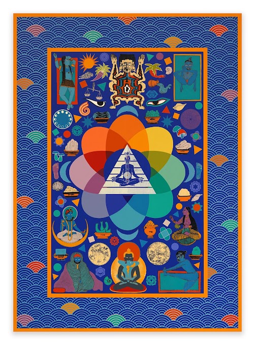
Namaste (From India To LA), 2023, Acrylic on canvas over panel, 84 x 60 inches Photo: Courtesy of the artist
MT: Are these based on thangka paintings?
KP: Oh, sure. Then there’s elements of Tibetan medicine painting in those works, references to astrology and tantric imagery.
MT: So you’re referencing a history of meditation?
KP: There is a relationship between meditation and painting. There’s also a painting in the show titled Namaste (From India to LA). If you think about something like yoga or meditation, again, it’s something that was transplanted from Asia and ended up in the United States and transformed into something that looks quite different than where it came from. That relates to so much else in my work.
MT: Translation is a central part of your practice.
KP: I often talk about the different series of work in my studio regarding other languages. That’s because of my family and the people around me, and often at dinner tables where languages are spoken that I don’t necessarily understand. Or only understand little bits and pieces of it. So, things have to be translated. I often transform processes, materials, and images in the studio, and through those translations, you inevitably lose and gain something, much like with language.
MT: Can you tell me about your Guest House project?
KP: I started Guest House to bring people and artists who wouldn’t typically get together in LA. Another reason was to create community and support for other artists, whether that was sharing my experience of being in the art world with artists just starting or giving them a space to experiment that would be more difficult in a commercial space. It also brings together, for example, the Iranian community within LA, the largest diaspora of Iranians in the world. Guest House has become an enriching, fulfilling, and beautiful way to connect with other artists, whether at an exhibition, residency, falafel night or a movie screening. It’s been really exciting to have that space to collaborate with others.
Ever dreamt of flaunting a Picasso, cruising in an exotic car, or donning a rare diamond? Imagine doing all. Continue reading
In the vast tapestry of existence, every man is born with a unique purpose, a destined thread intricately. Continue reading
Eric White- "Local Programming" Written by Mario Tofano Druiding (Fantasy Island) “The. Continue reading
In the countryside of Derbyshire, England, Georgia Dymock grew up in her family home, with her brother and. Continue reading
