The Touch of Red: Chellis Baird National Arts Club 15 Gramercy Park South, New York, NY 10003
March 21 – April 8, 2022 Opening Reception: March 23, 6-8pm Artist Talk: March 29, 7pm Register link: https://bit.ly/3JFLcBg
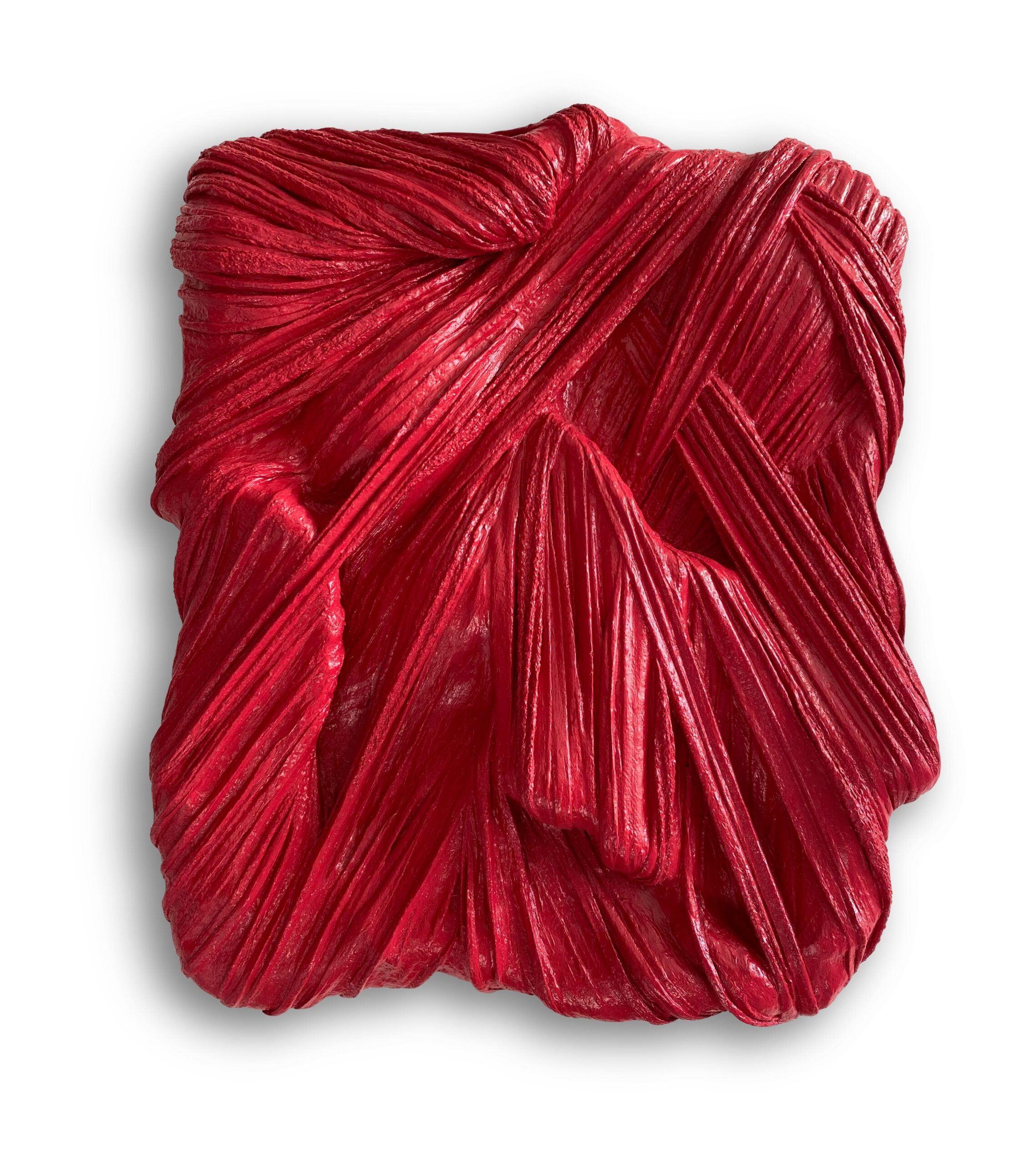
Currently on view at The National Arts Club is The Touch of Red, a solo exhibition by 2022-23 NAC Artist Fellow Chellis Baird. In this fiery show, Baird explores the complex significance of the color red, while expanding upon her signature techniques of sculpture, painting and textiles.
Inspired by her favorite lipstick hue Lady Danger by MAC Cosmetics, the color explores a wide range of feelings and history, including contrasting emotions of love and pain, as well as symbols such as good luck, war and seduction. While some of Baird’s works hold the most potent and saturated layer of red such as cadmium, others retain faded versions of the hue like a pink ballet slipper. Included in this exhibition are Baird’s first silver gelatin prints of lipstick marks which embody what the artist dubs “a ghost of red.” The artist also developed her first metal and resin works titled Serpentine and Flirt with a foundry in Long Island City. The overall body of work presented in The Touch of Red celebrates the many perspectives of the human condition that range from passion to rage. On Tuesday March 29 at 7pm, NAC will host an Artist talk between Baird and curator Jenny Mushkin Goldman. To Register, please click here: https://www.eventbrite.com/e/artist-talk-chellis-baird-registration-295277672467
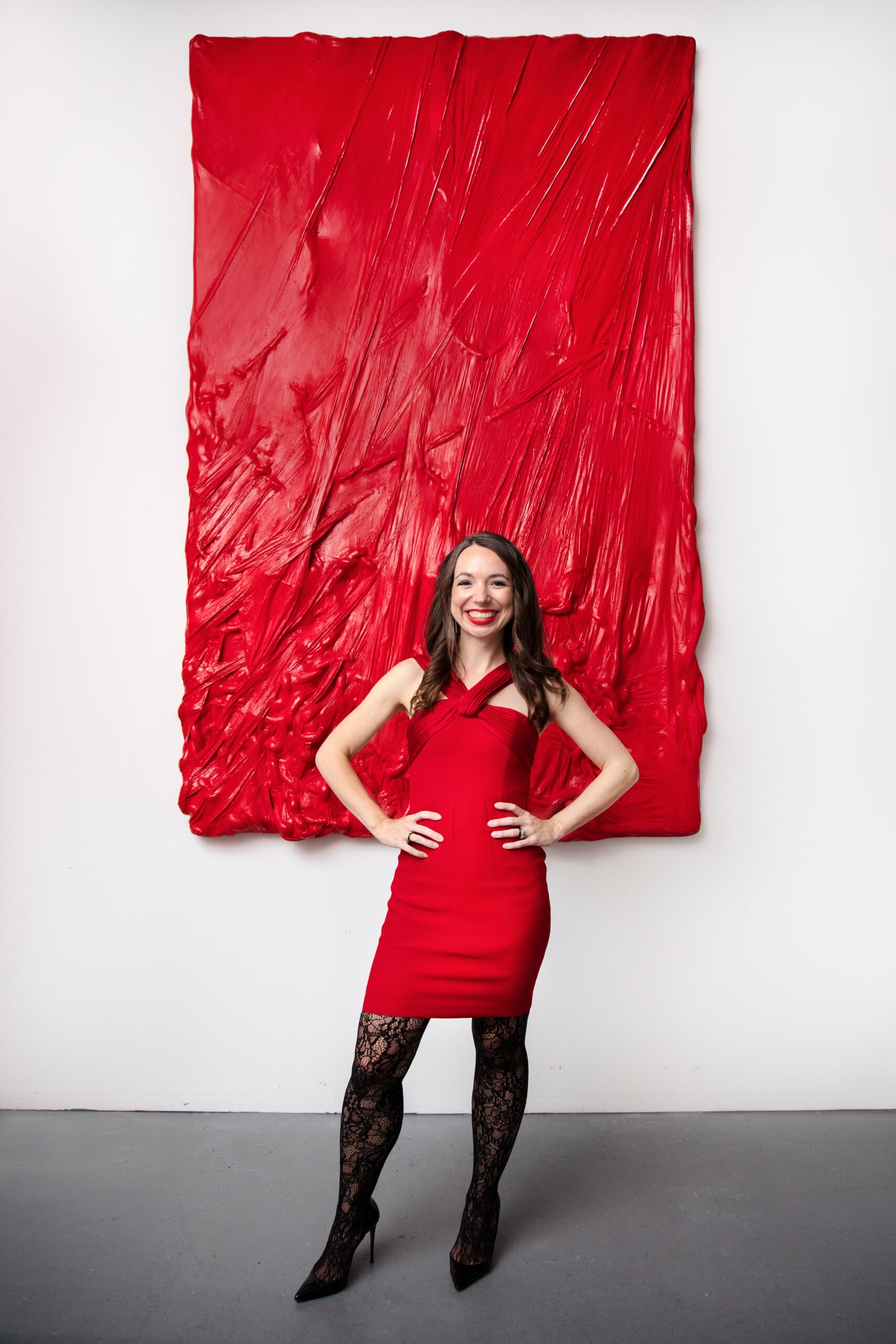
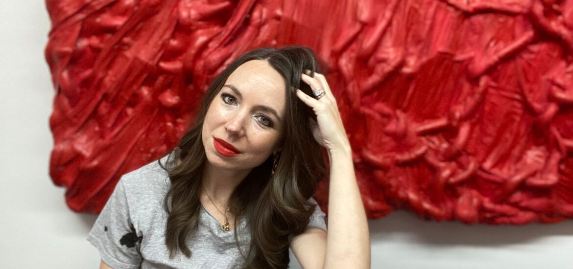
Chellis Baird in front of “Everlasting Red”
Heather Zises: How did the idea of creating a show centered around your favorite color evolve?
Chellis Baird: I always wanted to create a show around my favorite color. I have been searching for the best way to present this in a space that has intimacy and gravity. The West gallery at The National Arts Club is centrally located to the building’s foundation. This central location feels almost like the core or an internal space full of warmth. Red encompasses opposing positions like sweetness and seduction or war and good luck. I am drawn to its complex history and alarming nature. I somehow find it calming and yet full of surprise. A series evolved during my exploration of red titled Lady Danger inspired by my MAC lipstick. The daily ritual of applying this touch of red offers many interpretations. During the reception MAC cosmetics sponsored an interactive artwork inviting viewers to color in a photo of my lips.
HZ: Some adjectives that come to mind about your work are bold, elegant and textural. How might you explain your work to someone who is legally blind or has never seen it before?
CB: The work is full of movement and winding turns and paths that seem at times separate but then are all simultaneously connected. The shapes are organic like water or muscles. I use my dance practice to create drawings in space. The articulation of these gestures are where my abstract forms begin. Sometimes when I am creating my compositions I close my eyes and draw in space and imagine what a texture or gesture may convey. I would love to create a show called Don’t Touch! and every hour the lights go out and everyone touches the works without being able to see anything.
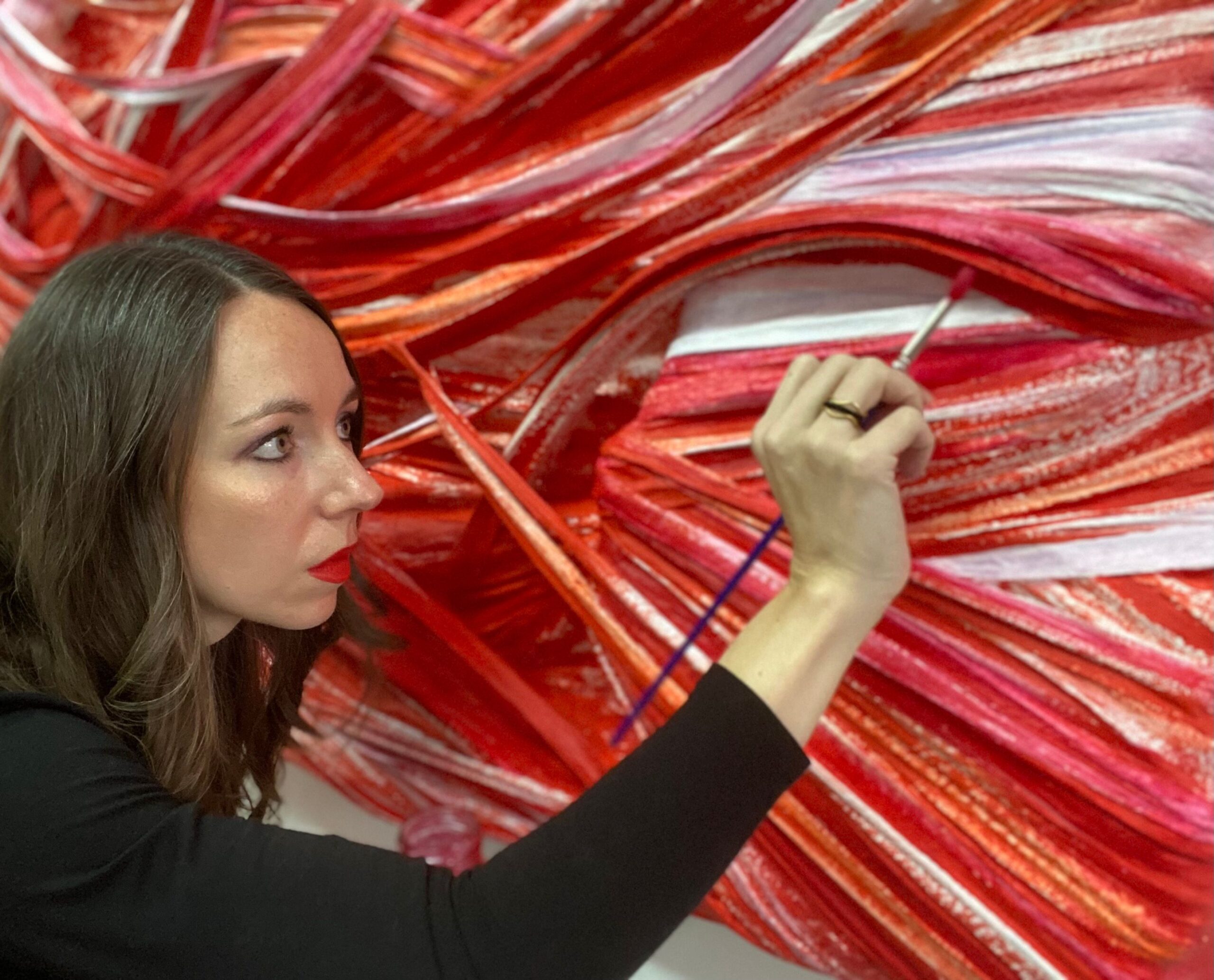
Artist Chellis Baird
HZ: For this series you make a departure from your creative wheelhouse by experimenting with new techniques and media like traditional photography (silver gelatin prints), gold leaf and cast aluminum. What was your favorite discovery?
CB: To see my tactile, soft fabric presented in a hard material like aluminum, resin or plaster was so exciting. It has opened a whole new channel of inspiration and I can’t wait to develop this more. The bonded aluminum is resistant to weather welcoming the work to live outside or even in a high humid space like an indoor pool. I would love to create more outdoor works. To see the work in natural light is the most beautiful. The photograph offered a fun tongue and cheek layer to the overall presentation while being possibly perceived as landscape or aerial view. I believe this is a way to share how abstraction can expand our perception.
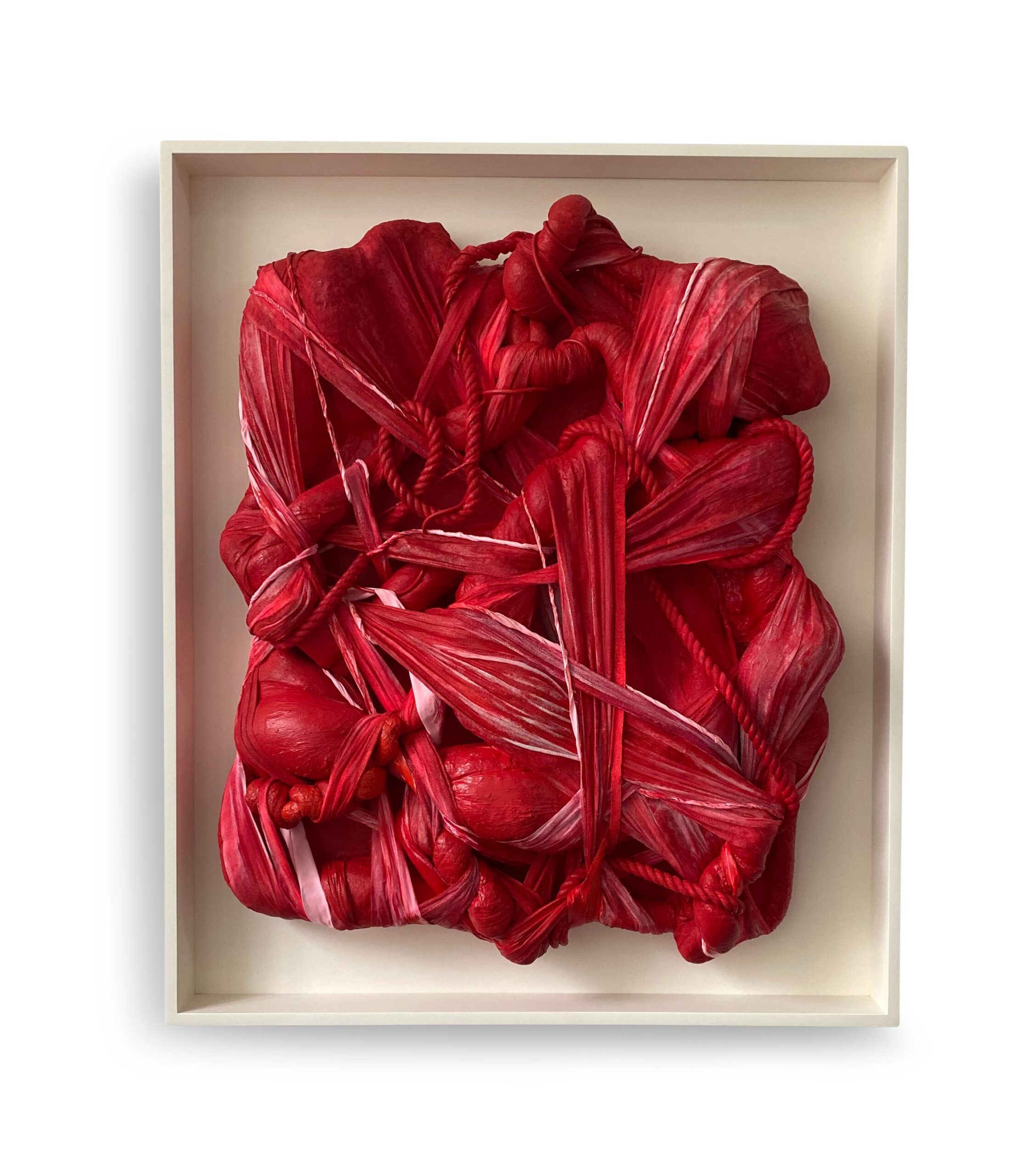
Lady Danger
HZ: You created a customized shade of red paint with MAC Cosmetics for this exhibition. What was the process?
CB: I love wearing Lady Danger lipstick by MAC cosmetics. I began by kissing different types of paper throughout the day in my studio while mixing paint. I noticed as the natural light shifted sometimes the cadmium hue became more pink or blue depending on the light. I began to mix different shades to evoke the color’s complexity and worked with a paint store in New York and Georgia. Lady Danger I is a mid-day pink and red twist while Lady Danger II has a more 2am seductive allure. The compositions were inspired by the way one’s mouth moves throughout the day.
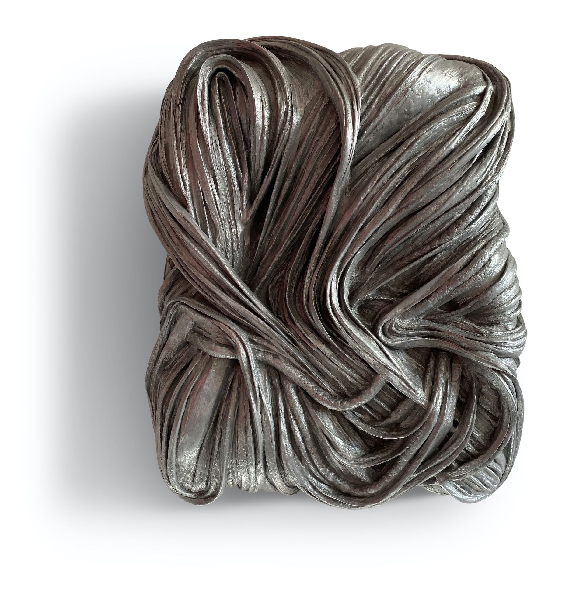
Serpentine
HZ: The beginning of your exhibition presents a curve ball in the sense that two non-red works flank the introductory wall text; Serpentine, 2021 (cast aluminum) and Pout, 2022 (a silver gelatin print). This recalls a heady concept in your artist statement about a black and white version of red–something you call “the ghost of red”–in some of your pieces. This could be interpreted as a visual palate cleanser to prepare for the show. What was your intention with this unexpected installation approach?
CB: Red lingers. Think of a hot room and you leave and yet feel red without actually being red. I wanted the viewer to stop and think what is red for them? What experiences of red have they seen? The works on this wall– Serpentine and Pout–both offer a history of red. I think of Serpentine as being a warm embrace or hug like quality. The word ‘serpentine’ can mean a long winding road or path. If you think of the way these roads or paths circle around us like a hug. Pout is an abstract photo of my lips. This was created by kissing the paper with my Lady Danger lipstick on, and then blowing it up and re-photographing in black and white. The contemporary image presented in the classic silver gelatin offers a twist.
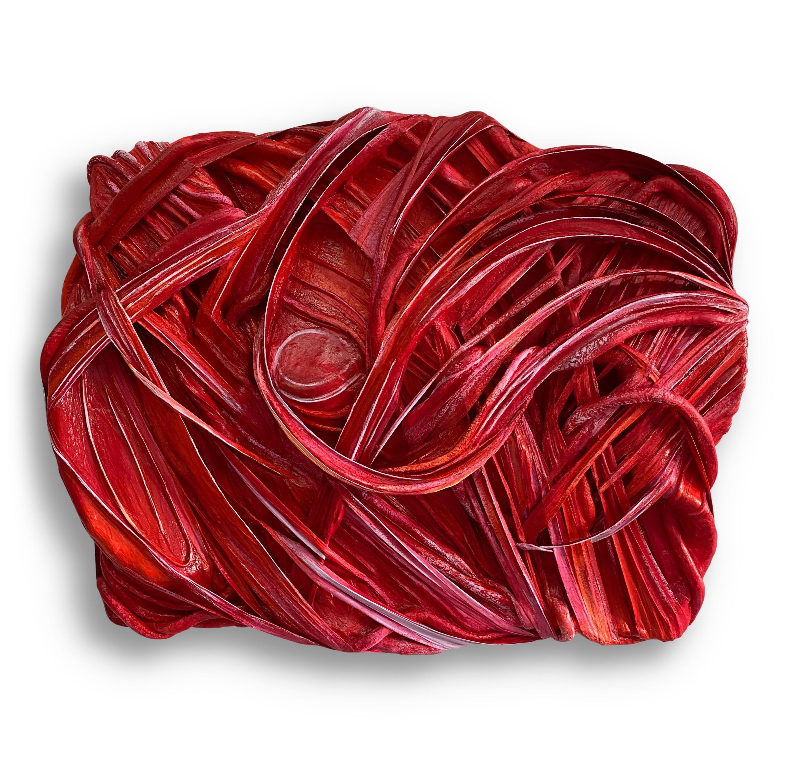
Betty Boop
HZ: Titles like Sensation, Flirt, and Betty Boop have a retro-chic sensibility in a very avant garde era. That said, did the global need for nostalgia during the pandemic feed into the genesis of these titles?
CB: Perhaps there is a bit of nostalgia post pandemic and during the pandemic. I think for me Betty Boop has many facets and layers like the color itself. It was what I called my Grandmother, it was a favorite childhood cartoon, and I always think of her in a red polka dot dress. The cartoon character offers the duality within red to be both flirty and naive, and also a femme fatale. I love this multifaceted complexity.
HZ: There will be an interactive element with Pout (2022) at the opening reception. Can you please elaborate upon this?
CB: A series evolved during my exploration of red titled Lady Danger inspired by my MAC lipstick. The daily ritual of this touch of red offers many interpretations. During the reception MAC cosmetics sponsored an interactive artwork by inviting viewers to color in a print of Pout. Pout is the silver gelatin photo of my lips. Follow me on Instagram to see the final work! @chellisbaird
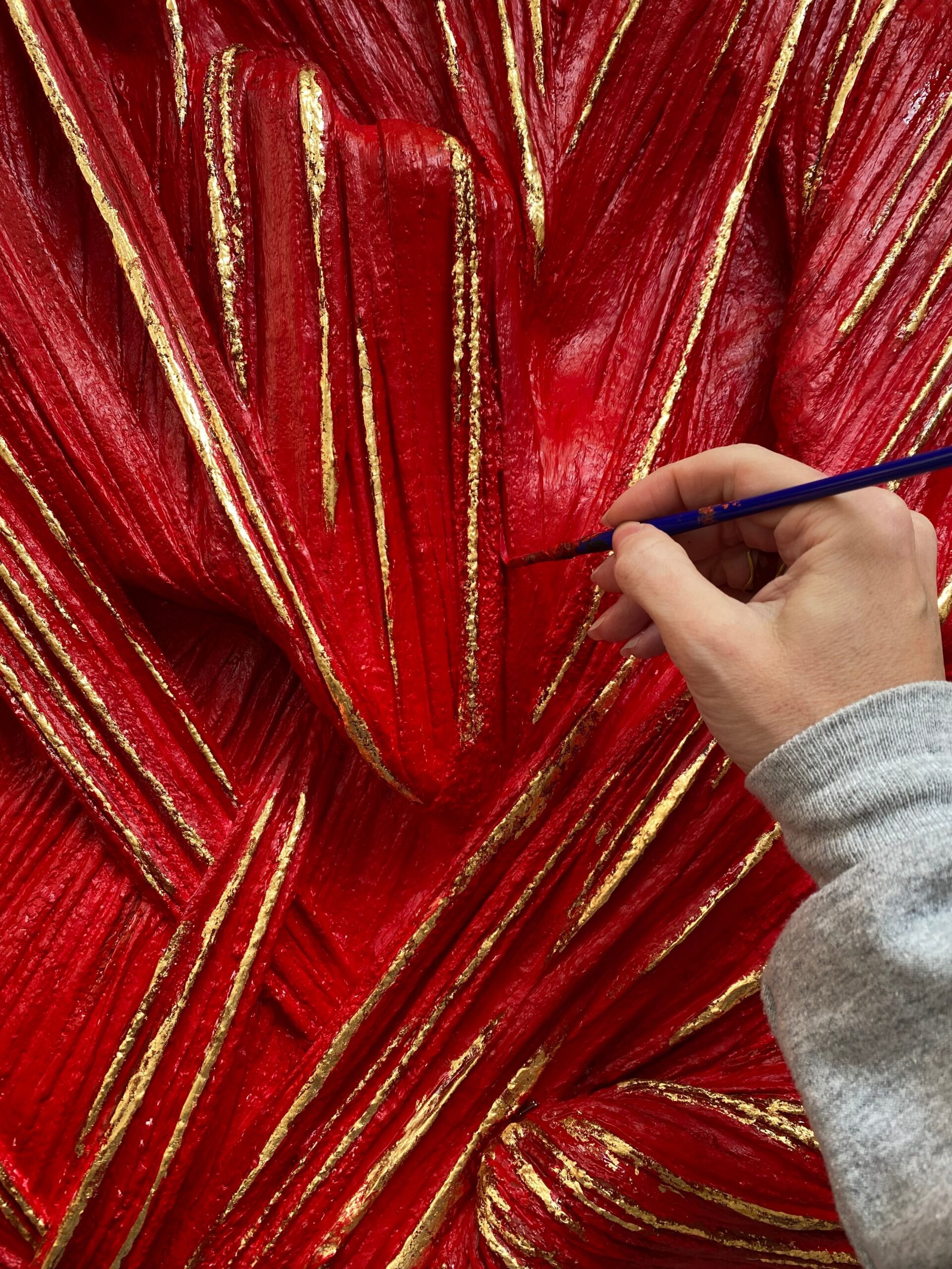
Details “Flirt” Goldleaf
HZ: The National Arts Club is a historic organization in a landmark building in Manhattan. How did these cultural strands influence the staging of your show?
CB: The back restaurant has a gorgeous inlay of fruitwood that has been hand carved into floral design with gold leaf surrounding the edges. The textural wood has a similar surface to my textural paintings. I began to research the best gold leaf suppliers in the city and had a workshop with Sepp Leaf. The historical family run company supplies many artisans, architects, and artists with an array of golds from around the world. I was immediately drawn to the 23K red gold leaf from Florence, Italy. It had 1.5 percent copper in it, offering enough warmth to complement the red, while being a small enough percentage to never tarnish. The gilded works are also on view at the private club, Zero Bond in Downtown Manhattan. (You can DM me for an appointment!)
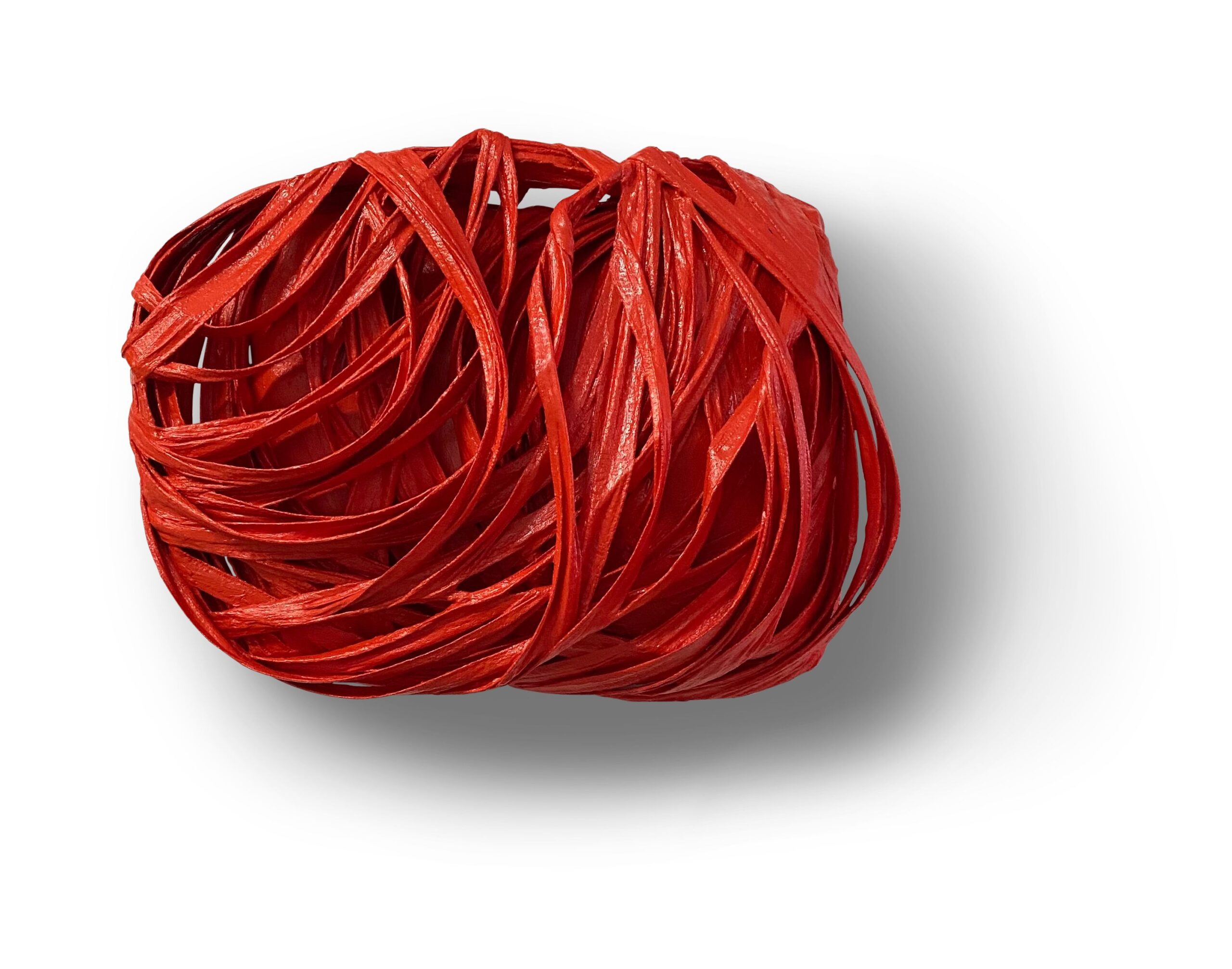
“Sensation”
HZ: The Touch of Red celebrates the many perspectives of the human condition through passion, love and warmth. What message do you hope this exhibition will communicate?
CB: We make many decisions in life based on color. It is such an emotional facet to our choices of which we are not always aware. I hope viewers leave with a new experience of the color red and a new appreciation for their own color choices. All of my work leans toward the analog realm as it is deeply rooted in physical gesture in today’s digital world. I hope the tactility of my art is a reminder of the importance of the human hand and touch. Life is about relationships!
